Griffin Associated


Portfolio

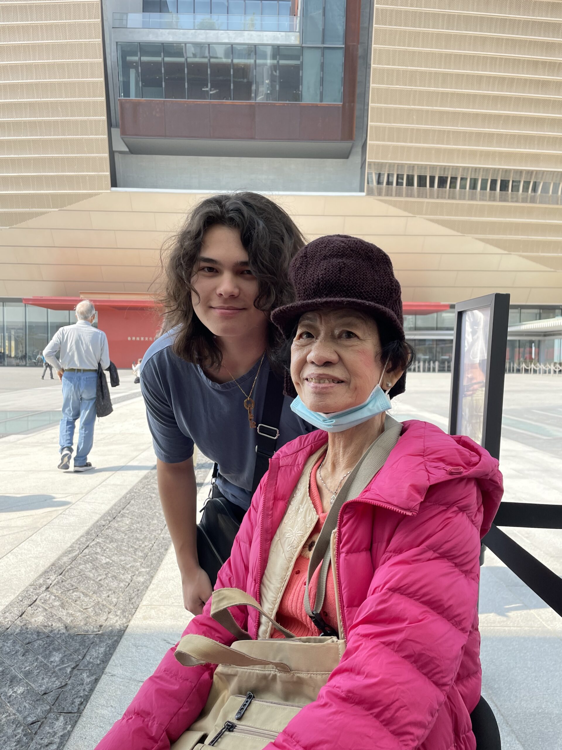
This is a photo of me and my grandmother, who is currently living through the last days of her life. It’s been a heart-wrenching experience to know that her days are numbered and it reminds me to be grateful for the time that I have with the people I love. It also reminds me that time is limited and that we have no choice but to cherish it, or waste it away.
I have said for a while now that my greatest fear is time. But I think it’s worth diving deeper into that. So, what does Google say time actually is? Here’s its definition:
the indefinite continued progress of existence and events in the past, present, and future regarded as a whole.
I think indefinite can be a frightening word with different meanings—it indicates uncertainty, for better or for worse. So, is it uncertainty I’m afraid of? Or is it uncertainty of the “progress of existence” itself? I believe its the latter. To me, time indicates that death is approaching, since time is most meaningful to oneself when we actually exist. Despite this fear seemingly opening up more and more questions, the passage of time—both present and anticipated—leads to a sense of urgency and motivation to achieve life’s goals, whether that be fulfillment, happiness, meaningful connection, purpose, or meaning. No matter where we are headed, the clock is ticking.
If time was meaningless, I would have an infinite amount of time to do an infinite amount of things. But it’s not, and that creates a sense of urgency to “have it all figured out,” and when I don’t have that I panic. While I obviously don’t have it all figured out, nor do I expect to (I don’t think anyone ever can), I have found some ways to alleviate my fear of time.
I try to treat time like it is meaningless—or in other words, live in the present. This obviously isn’t a novel idea, however it is easier said than done. If we are so focused on worrying about beating time or getting everything together, we miss out on the present moment that might actually fulfill what we are chasing. Here are a few of my ways to stay present:
My first way of staying present is to love the people around you. This means showing appreciation for everyone in your life, through the things you do and the words you say. While it sounds basic, maintaining meaningful relationships is a pinnacle of my life and keeps us all grounded. The second crucial part is to make it known. Make sure the people around you know you love and appreciate them! In my opinion, making your love known only has a positive butterfly effect. I believe this helps to positively influence the people around us, which gives us a chance to forget about time. Instead of worrying about what train to catch or what deadline we need to meet, we should be focused on connecting.
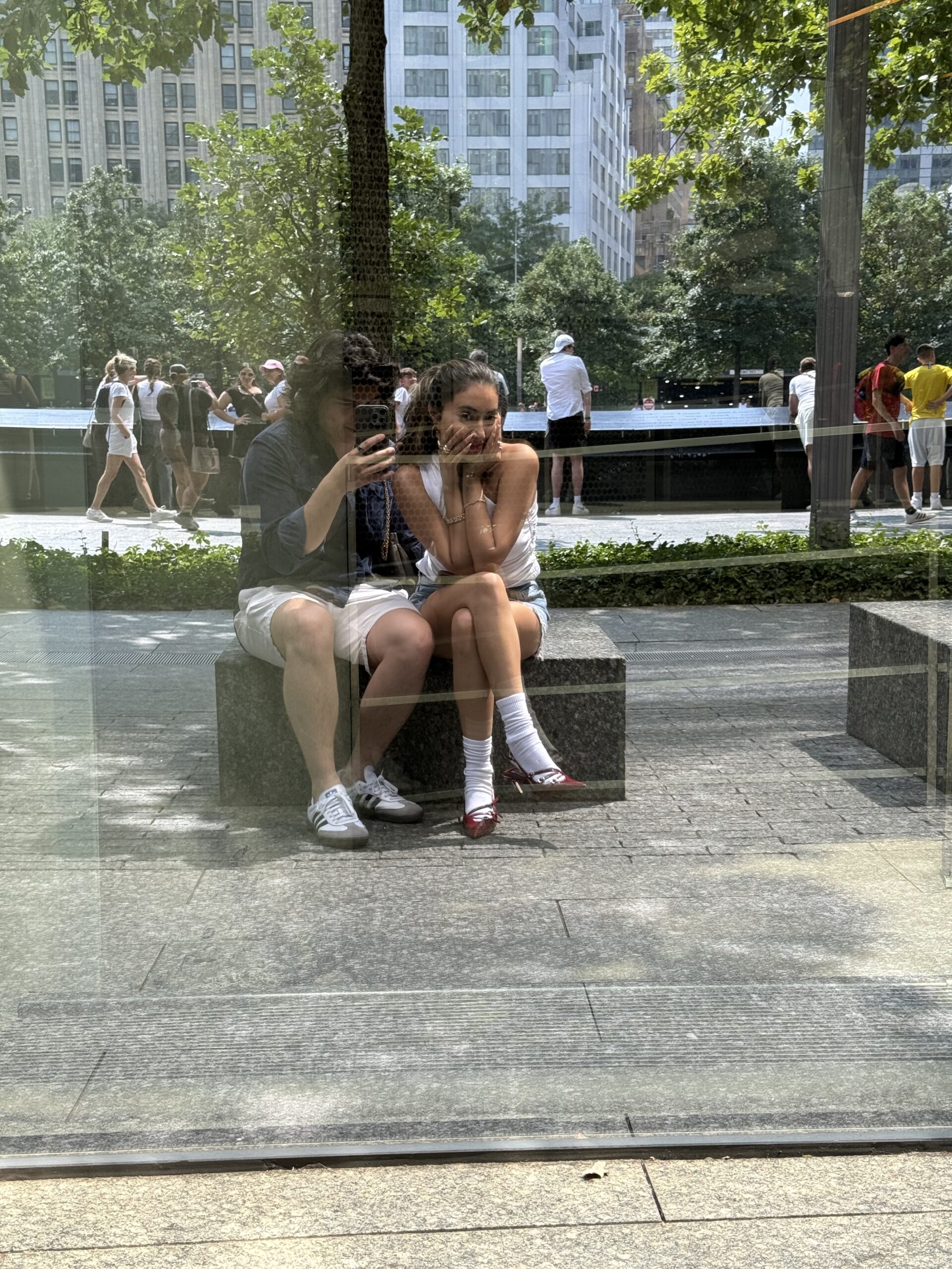
The second way to stay present is to embrace your passions. This is how I like to take care of myself. By letting myself get lost in the intricacies of what I enjoy, I lose track of time. Whether it be embracing art, expanding your knowledge, or learning a new skill, every person should find something they can get lost in. Our passions are our escape from the anxieties of life’s ticking clock—why not embrace their reality?

One other way I love to stay present is to travel. Traveling gives us a chance to see what else is out there, to learn about the world, and to expand our perspectives. By traveling we can be present in another environment that we are unfamiliar with. We can see what it’s like to live among a different culture. This informs us with gems that we can bring back to our own lives. Every individual has a unique experience; by exploring the experiences of others we can positively morph our own.

Each of these ways of staying present are important to my life because it makes time more meaningless. I strive to make time meaningless not in a nihilistic but in an optimistic way. It takes away the anxieties that may come with setting out to achieve things. Instead we may find that we are actually achieving our goals simply by focusing on and appreciating where we are in the present. By shifting our perspective, I believe we can all find fulfillment in the moment.
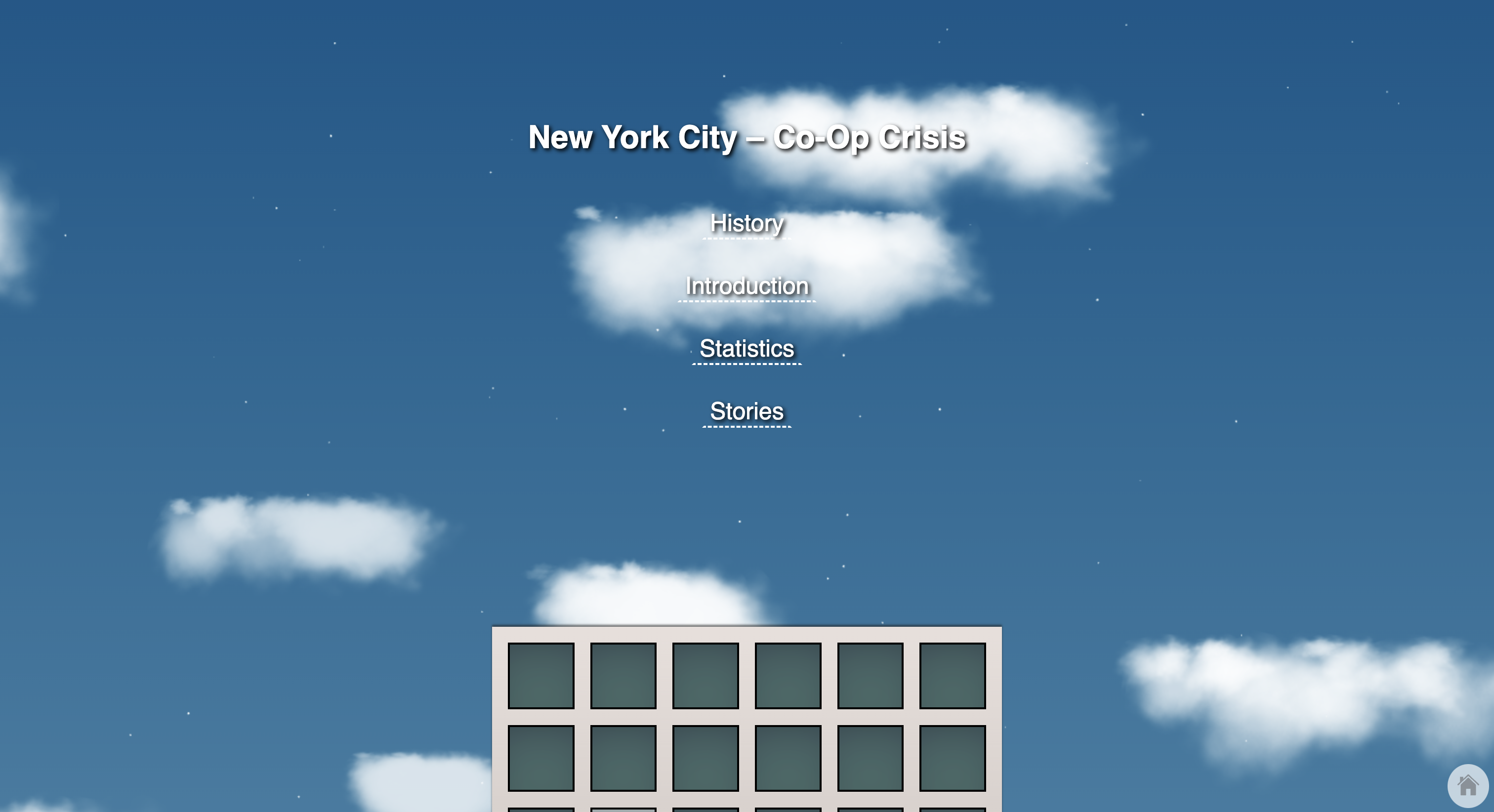
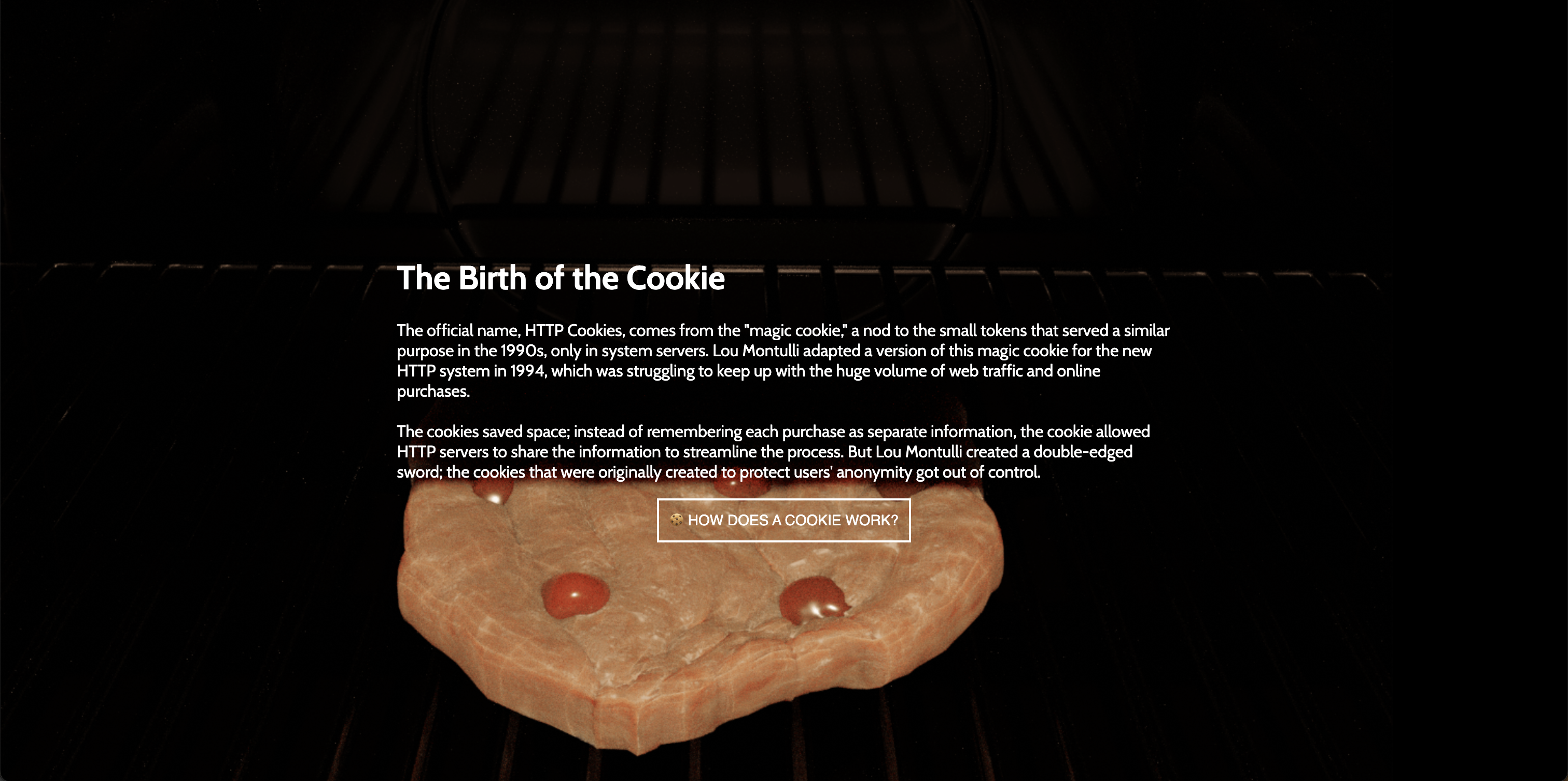
An interactive experience designed to inform the public about digital privacy while encouraging behavioral change through the rejection of cookies.
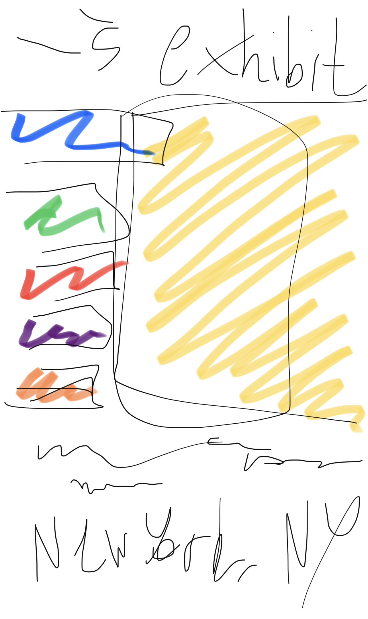
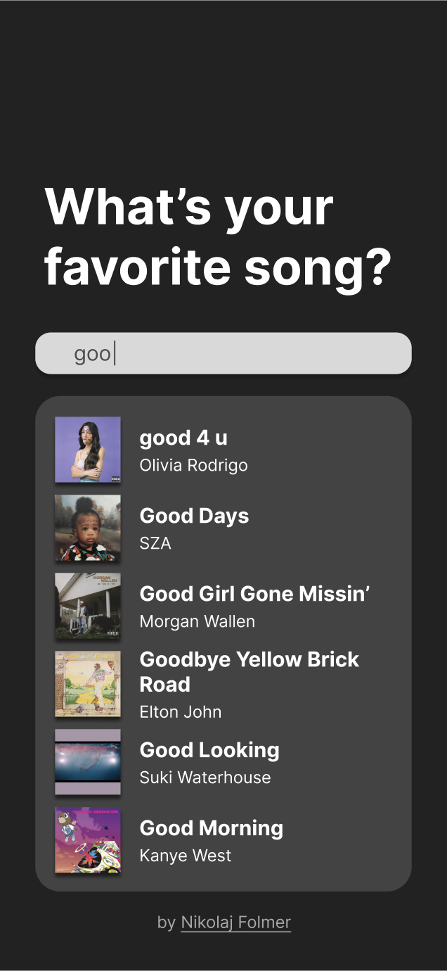
This project is an interactive online experience that features music tastes from around the world and visually synthesizes the data to seek out and share trends with viewers, who can also add to the work. The gallery features AI-generated imagery using music trend data as seeds, which are combined to form one large work as a whole. The piece will allow viewers to see how music tastes might differ geographically, along with how we might express ourselves via sound analysis; a sort of “algorithmic synesthesia.”
I have always been a very creative and musical person growing up, and recently I have been putting a lot of focus onto understanding new perspectives of those unlike myself. I wanted to choose something that would unite a large group of people who might not otherwise have something in common. Utilizing my artistic experience in graphic design and web development allows me to encompass a range of multimedia elements in creating this comprehensive piece.
I hope this piece puts into perspective a sense of community even among complete strangers, especially during a time where the world is so deeply divided. I also hope that the inclusion of visual elements serves to inspire the audience and encourage deeper collaborative thought. Viewers are able to add their own music taste to the piece, such that the dataset is constantly growing. Since everyone is able to add to the work, this piece is essentially always a work in progress that anyone can participate in.
As I conducted research and visualized the creation process for this project, I began to realize that the extent of the APIs required to coordinate the final product was more than I initially anticipated. I finally settled on utilizing the Spotify API to retrieve audio features, and spent time becoming more familiar with the API and the relevant information it can provide. I also chose to use the Google Maps API for reverse-geocoding, which would allow for users’ locations to influence the final prompt.
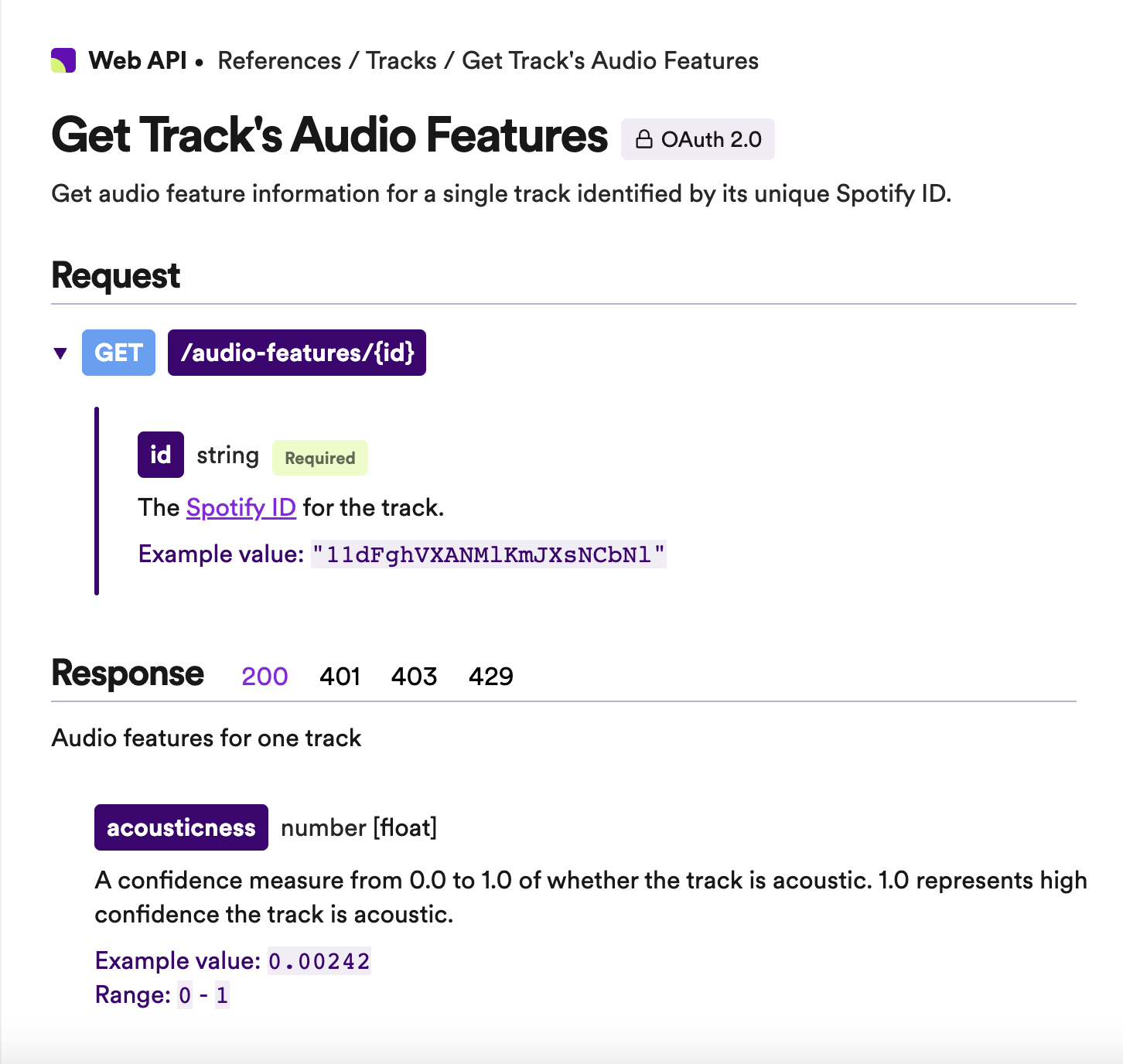
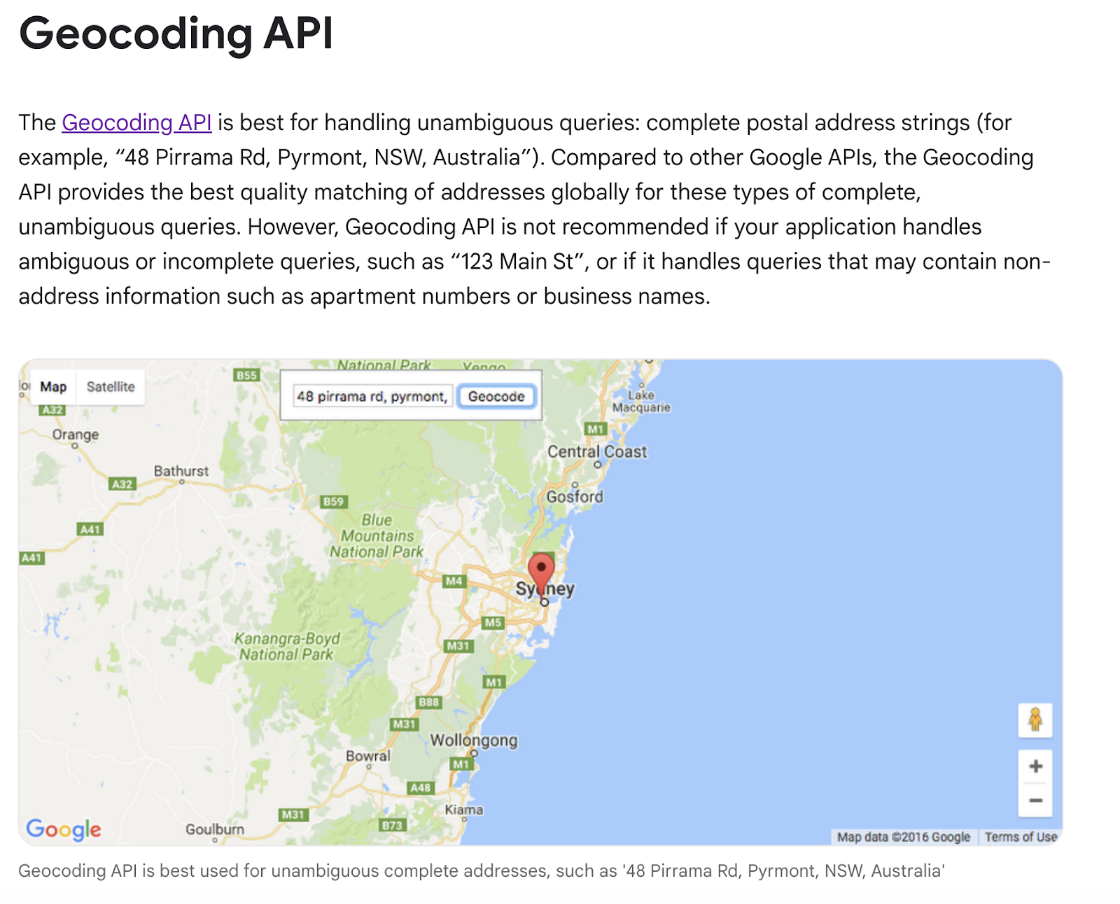
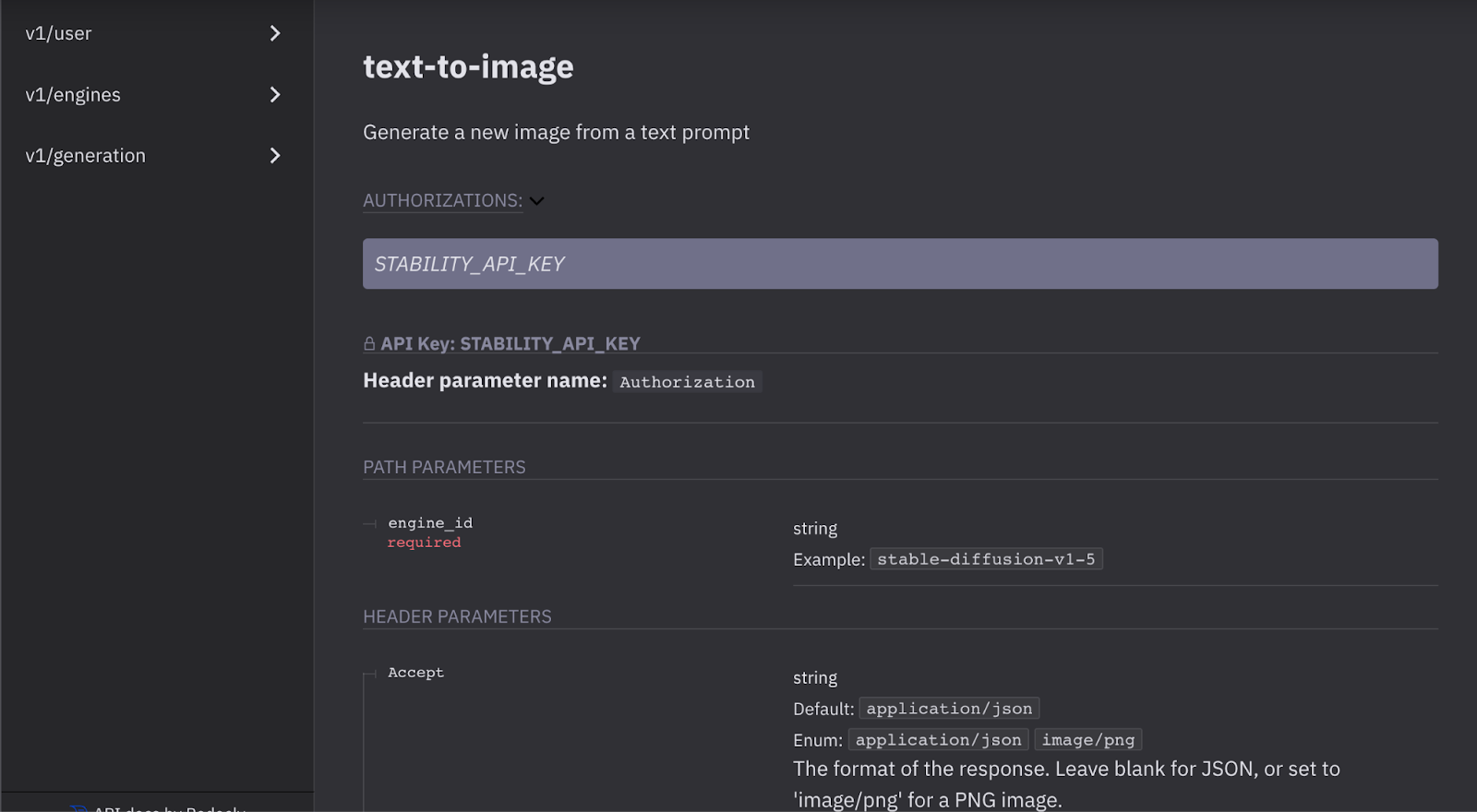
Finally, I used Stability.ai for stable diffusion via DreamStudio for AI art generation. The final web application is coded in HTML, CSS, JavaScript, and PHP on the server-side to handle API calls.
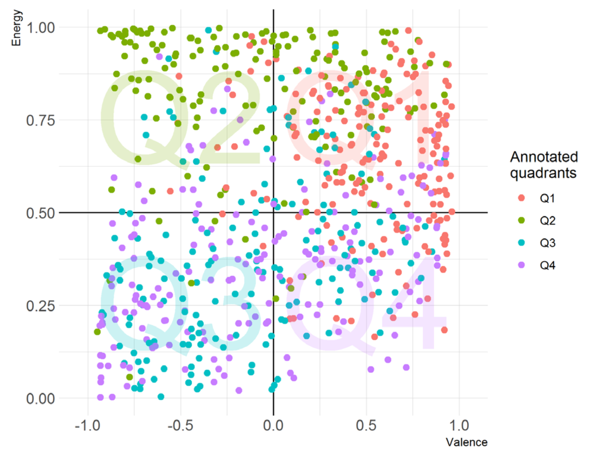
The following audio features are calculated using advanced audio analysis techniques, such as signal processing and machine learning algorithms. They are designed to capture different aspects of the music, such as its rhythm, timbre, harmony, and emotional content.
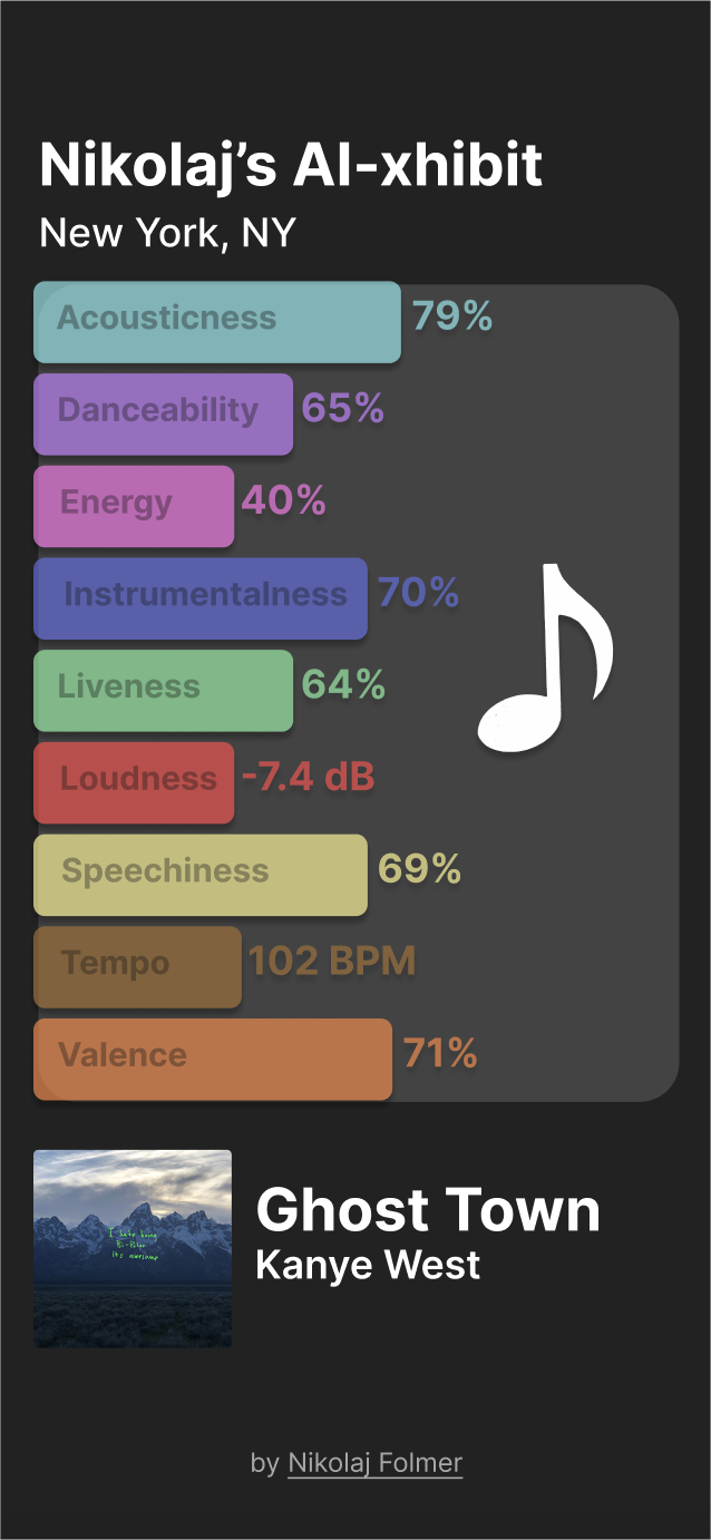
One of the biggest hurdles I encountered was deciding how I would generate an image prompt for the AI based on each song’s audio features. I played around with various stable diffusion platforms to test what phrasing might work best, while maintaining a balance between uniqueness and consistency.
I finally settled on using a reference table, which I created by assigning certain phrases to each range of audio feature values. The PHP script then builds a prompt string based on a song’s audio feature values and their correspondence to the reference table.
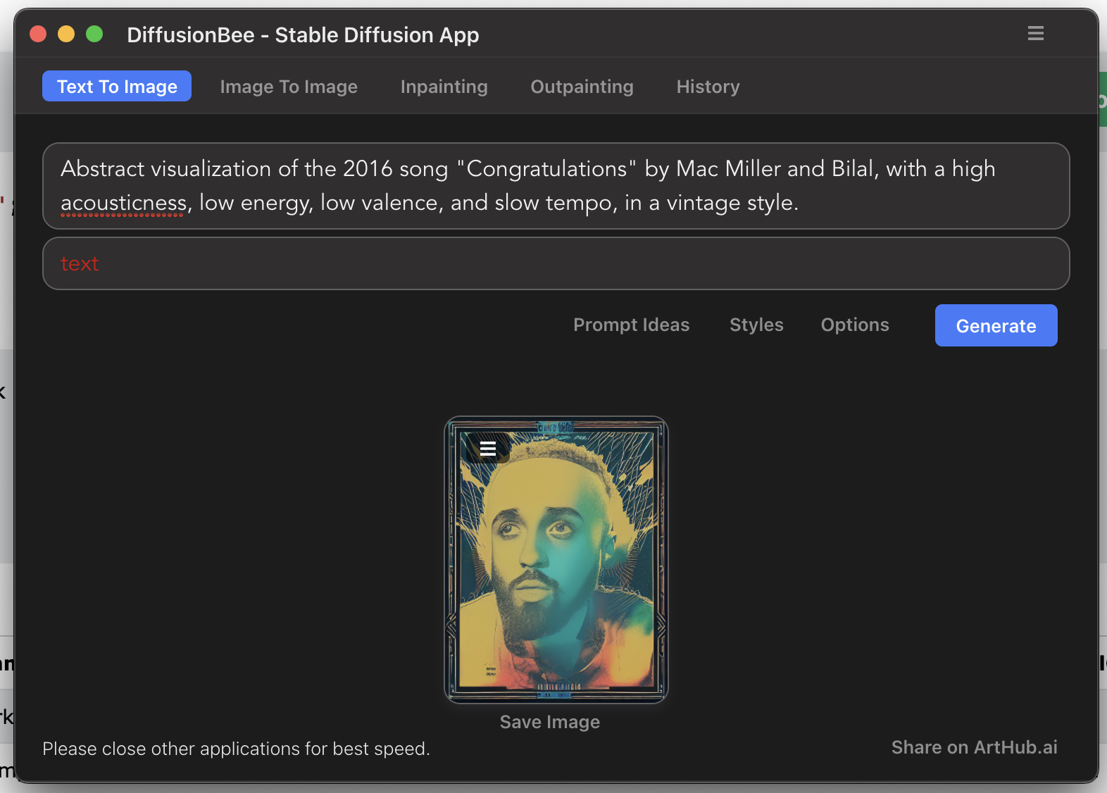
One small issue I encountered with prompting was that the DreamStudio API does not accept inappropriate words—which is not ideal for song titles that contain explicit language—so I had to write a function to sanitize the prompt before sending it over.
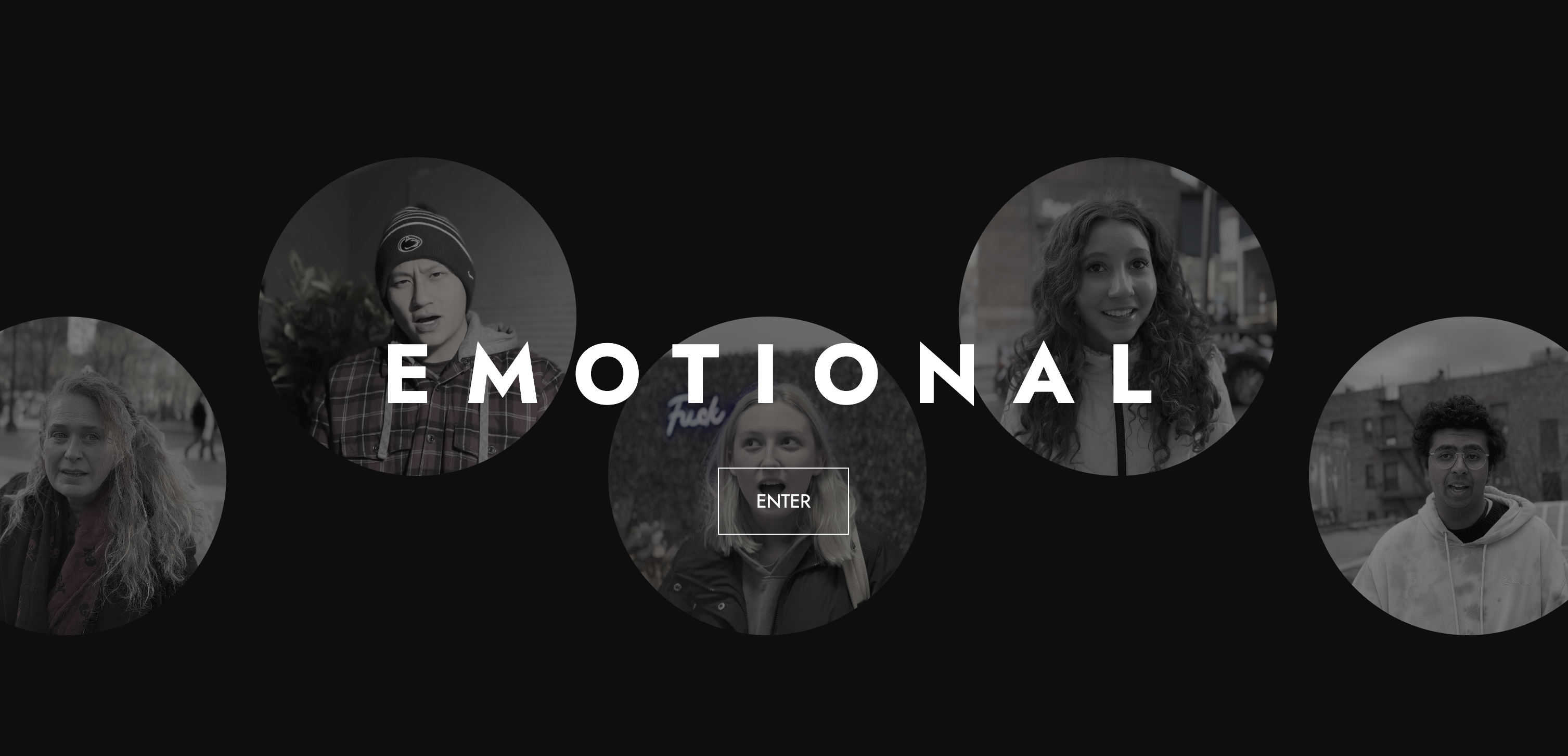
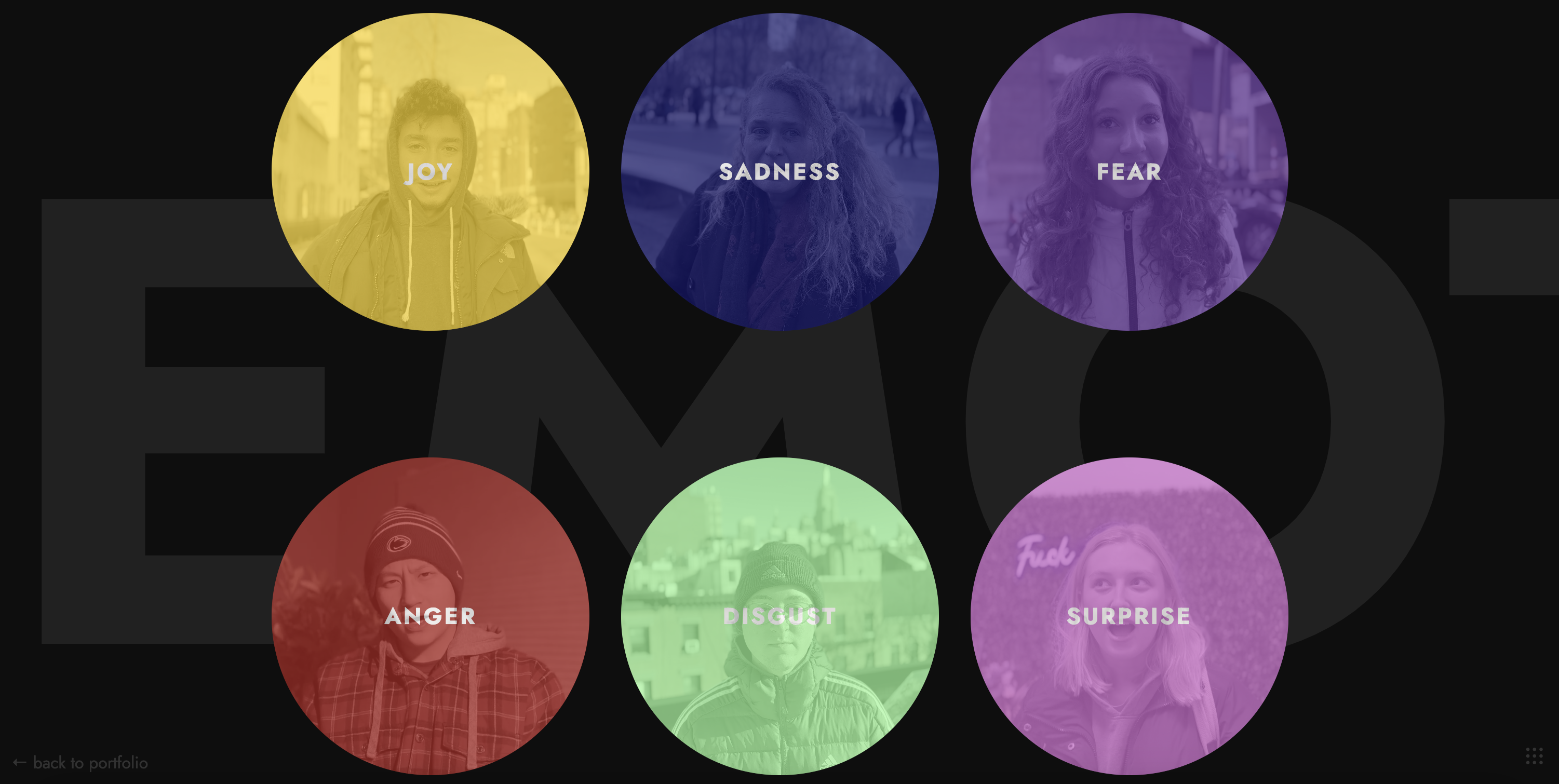
An interactive experience featuring a unique perspective on human emotion.
Nina McLemore is a distinguished upscale fashion brand specializing in professional women’s workwear. Worn by CEOs, public figures, and politicians, Nina’s collection is well-recognized. However, the brand’s online presence was lacking, and the store’s outdated website was in severe need of an upgrade.
Here is a look at the old Nina McLemore homepage after I made some initial CSS updates. While the site still appears very bare-bones, it was a start.
This old site was plagued by numerous issues, including broken links and pages, slow-loading images, and a confusing navigation system. These issues were a major source of frustration for users, resulting in numerous complaints about the website’s functionality.
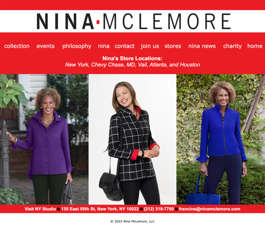
Upon viewing the old website, any visitor would be left pondering when it had last been updated. Driven by a desire to revamp the brand’s digital footprint, I made it my mission to breathe new life into the website and provide it with a refreshed, modern look.
One of the most pressing issues brought to my attention was that the old website still required manual inventory updates in order to keep the online store in sync with the warehouse. This was far from optimal, as it required an individual to go through all 70+ pages of inventory and edit each product manually, which only occurred every 1-2 weeks at most.
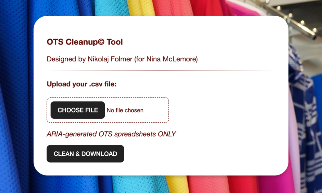
I developed a tailor-made inventory updating application to bridge the gap between the traditional manual record-keeping methods and the new Shopify website. This client-side app, written in JavaScript, is designed to eradicate the numerous human errors present in legacy documents and convert them into a Shopify-compatible format.
With its ability to sanitize inventory data accurately and efficiently, this application represents a significant step forward in streamlining the company’s inventory management process, providing a more seamless flow for backend operations.
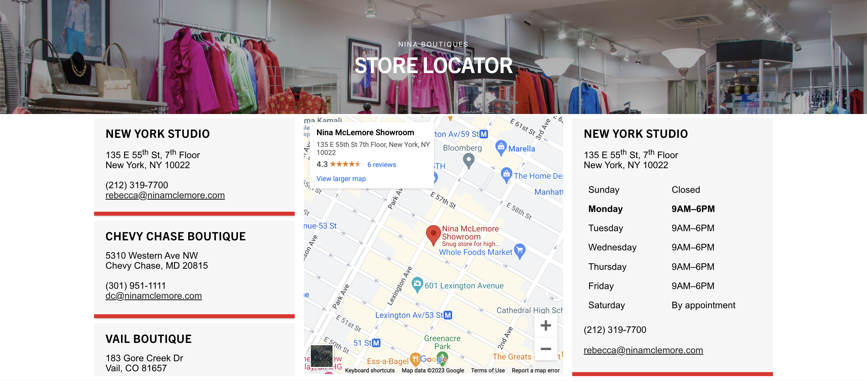
Further leveraging the power of client-side programming, I incorporated an advanced store locator that far surpasses the rudimentary PDF spreadsheet displayed in the past. This new store locator, integrated with Google Maps, is interactive and user-friendly, enhancing the overall customer experience on the site.
Other upgrades to the site included revamping the About and Press pages, along with modernizing the recruitment section. However, I did encounter the hurdle of spambots attacking the recruiting form. To address this issue, I swiftly implemented a reCAPTCHA feature, which has proven highly effective in preventing spam submissions.
Overall, the website’s new design boasts larger, more visually appealing images, streamlined navigation, and a more intuitive layout, vastly improving the overall user experience. The website’s organization has been significantly enhanced, making it far more user-friendly than its predecessor. This two-month-long design process has been both demanding and rewarding. Online presence is integral to a brand, and I’m excited to see what this redesign will continue to do for the company.

